Stacking artifacts explored with CG images
19 March 2014
Often times I do image stacks where there are problematic artifacts that degrade the image quality. I became curious as what the artifact areas may look like compared to a perfectly clean image. So I decided to create a series of computer generated images to explore the common artifacts I tend to see.
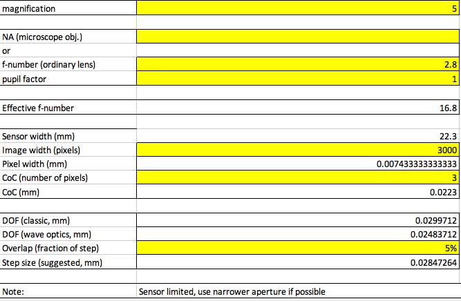
The series of 42 images was rendered with a physically based sample based renderer. The simulated effective aperture used was F16.8 at a magnification of 5:1. Reproducing a DoF approximate what one might see with an MP-E 65 at F2.8 and 5:1 magnification. The effective focal length was at 200mm, not replicating what an MP-E 65's FoV is, due to a slip of my mind. However, the depth traveled for the test was not great and the difference in perspective is marginal.
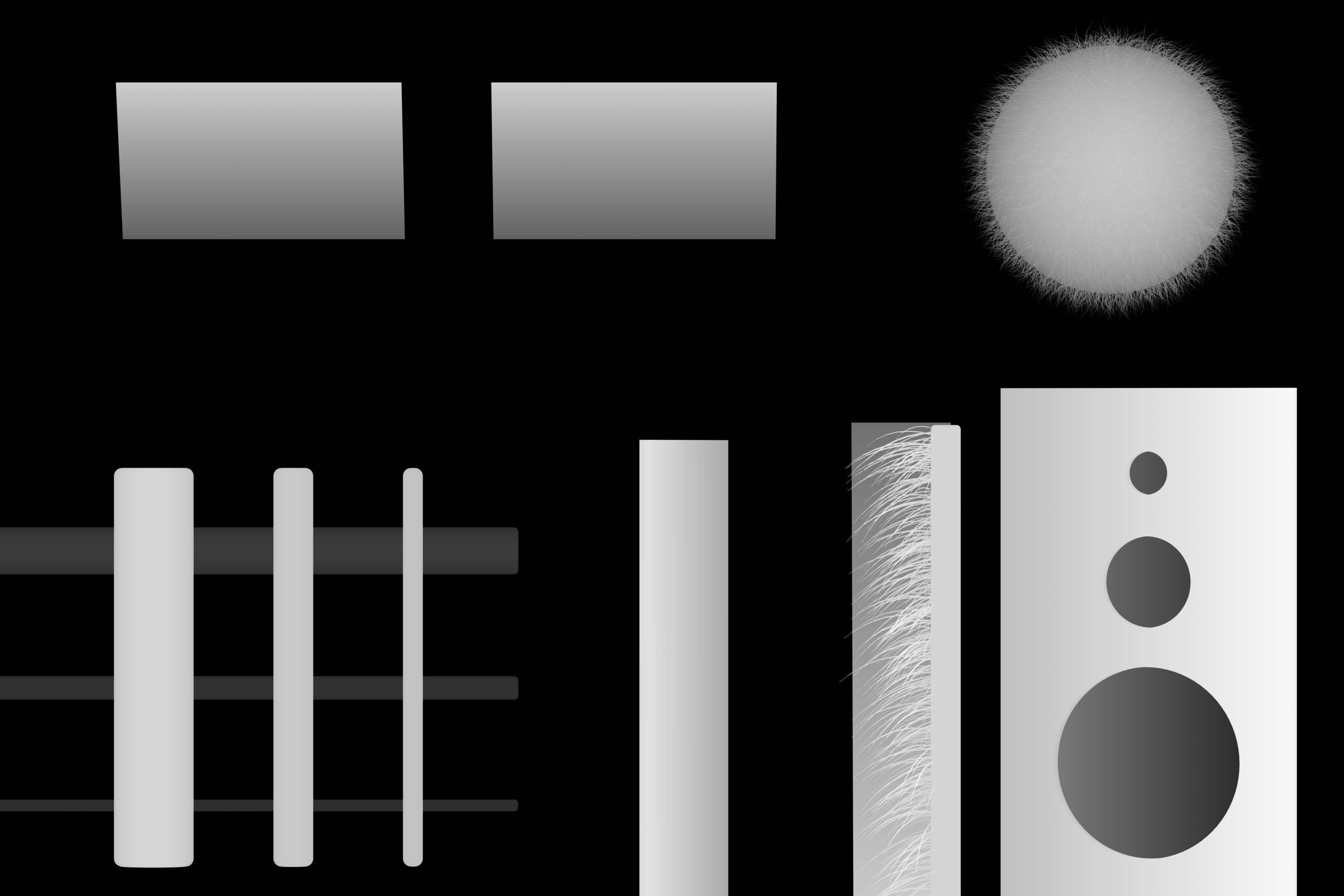
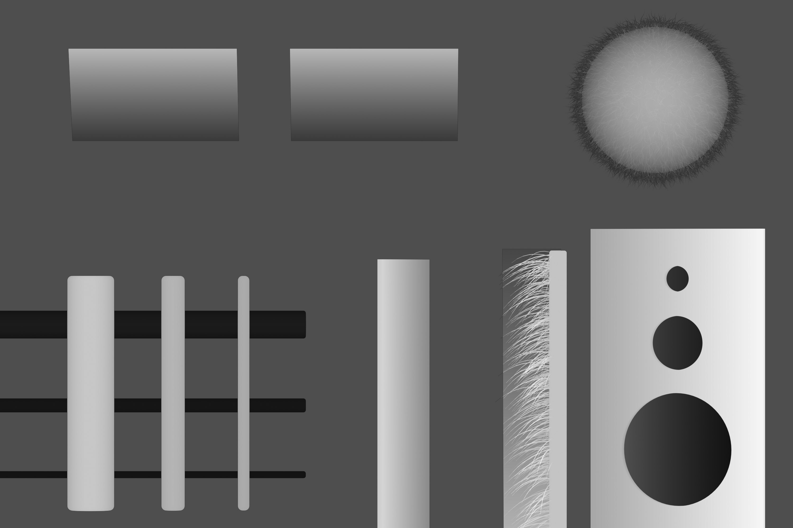
The image consists of 6 objects that are meant to exhibit stacking artifacts. Image noise was added to the top left panel after the images were rendered by overlaying neutral grey photographs that were taken with my 60D and processed in Lightroom. This gives unique and realistic noise per frame and replicates what I experience on average for noise pattern and intensity.
Below you will find a comparison of the scene rendered without any depth of field effects(marked 'NoDOF') then several different image stacking outputs to compare to.
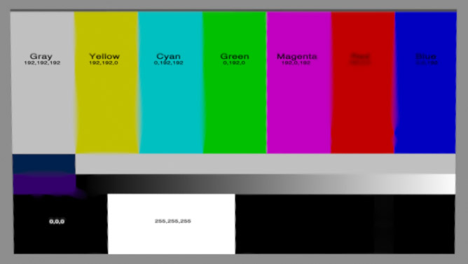
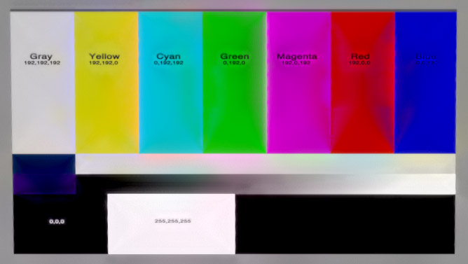
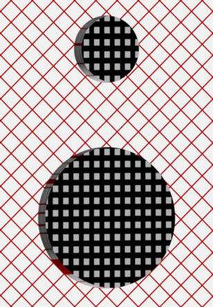
Lets start with the full image:
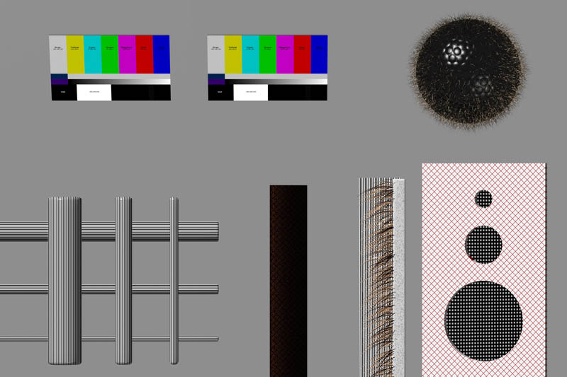
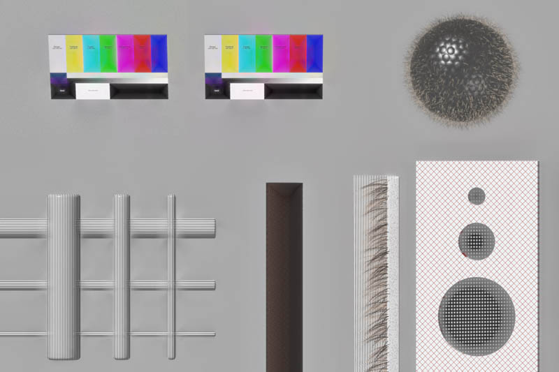
Here is how the full scene looks. Stacking artifacts should be easily noticeable on most objects, but to get a clearer view I have broken down each section into 100% crops.

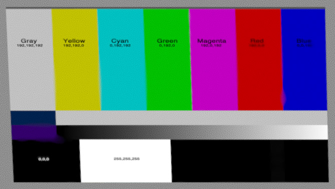

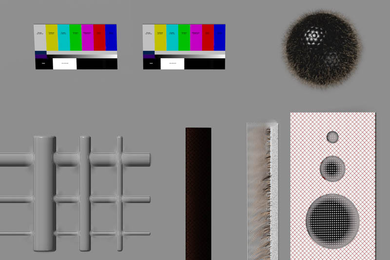
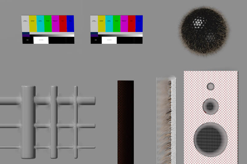
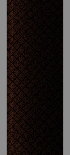
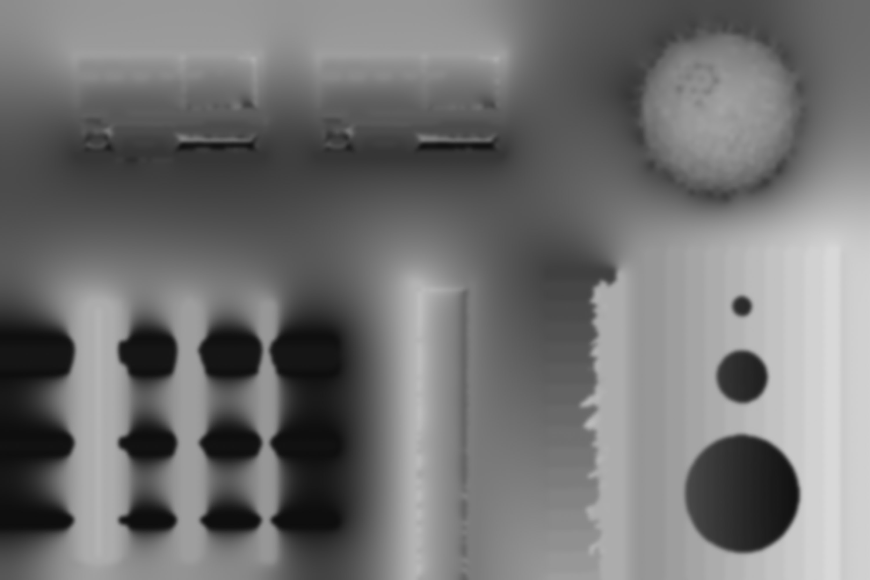
Here is the color panel with noise added in post. The structure of it is a simple plane tilted toward the camera with the top closer to the camera and the bottom further away. This primarily illustrates an increase of noise and contrast in Pmax. Dmap does a very good job keeping all the colors accurate and keeping sharp lines sharp. It is interesting to note the Pmax with RFDR on. I think the pyramid shape maybe an artifact of the very uniform DoF and straight lines or the stacking of 8bit per channel images. Further investigation would be required for me to know for sure.


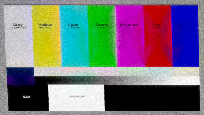
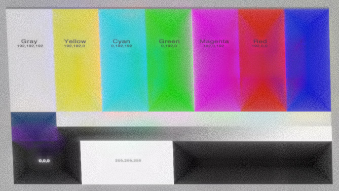
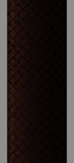
Here is the same color panel but without noise. Again, Dmap does well at keeping colors accurate. All colors for the Dmap image are identical to the render without DoF. Pmax also shows a minor color shift and increase of contrast here. Same artifact with RFDR is observed and still should be ignored for now. I will also note here that the stacking order had a minor impact on the Dmap images here with Back to Front performing slightly better at the same contrast threshold. I have not experimented to see if I can get identical results with front to back using a slightly higher contrast threshold.
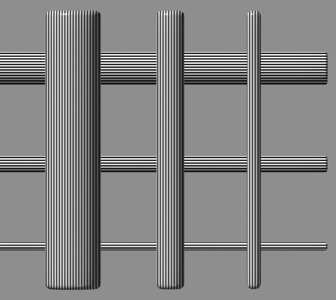
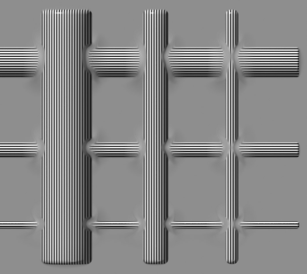

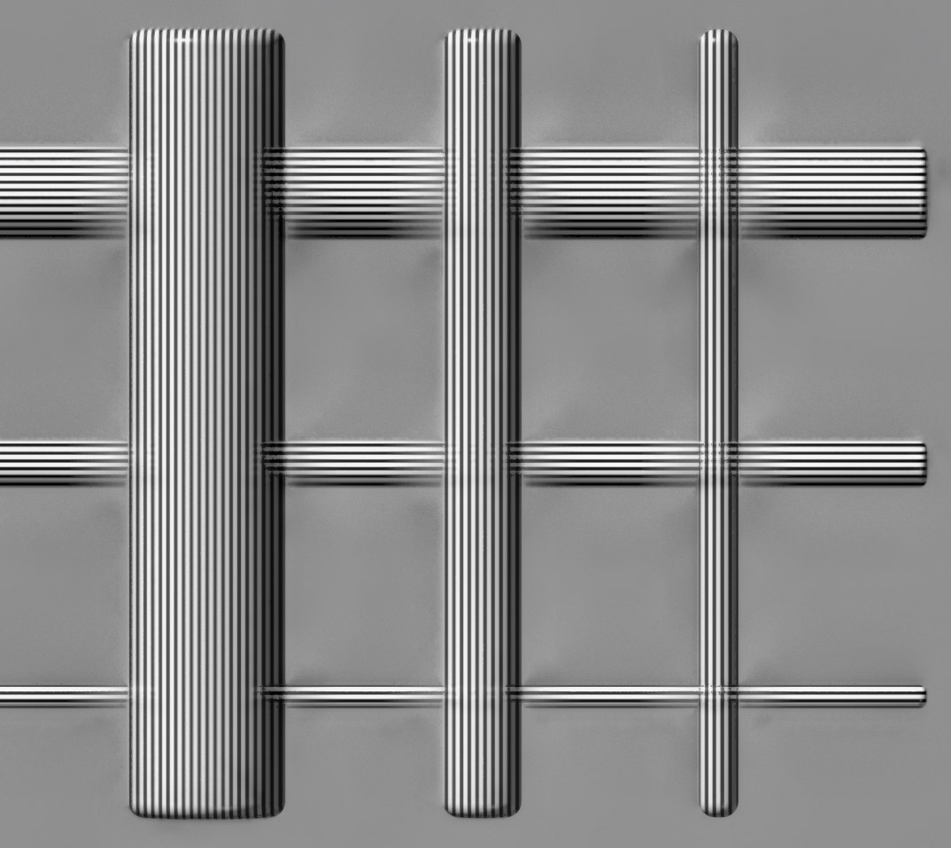
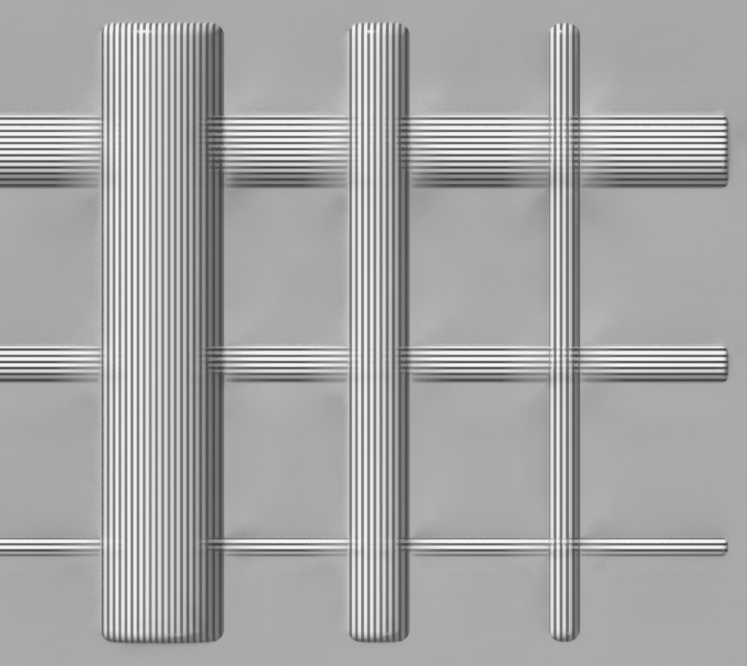
These bars are to help show the transparent foreground effect for Pmax stacking and overlapping halos for Dmap. Both are very clear to see with the two smaller ones going completely though each other in the Pmax image. This effect has been exaggerated by making the vertical foreground bars have less contrast than the horizontal background bars. I found that the effect still happened when both objects had the same contrast but to a lesser degree, and I wished to show the effect more clearly. On the other hand, Dmap halos were almost completely unaffected in my prior tests for both sets of bars having the same contrast. I excluded Dmap Back to Front and Pmax RFDR for being unremarkable.
This bar is mean to illustrate the loss of detail in dark, low contrast areas for Dmap and to show an increase of contrast for Pmax. A difference is again observed with Front to Back and Back to Front for Dmap images in the detail it holds. Pmax captures almost all the detail that is in the no DoF render as seen in the RFDR image. RFDR behaves as expected in the main body of the bar.
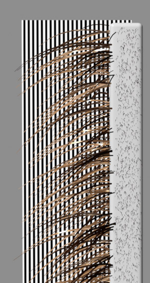
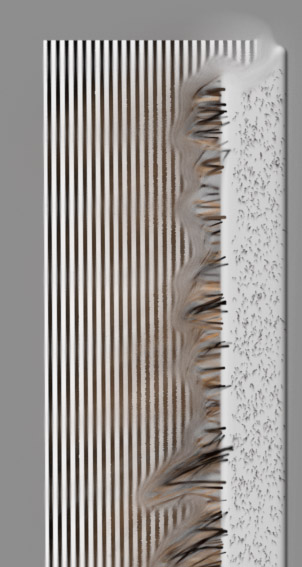

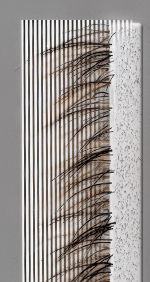
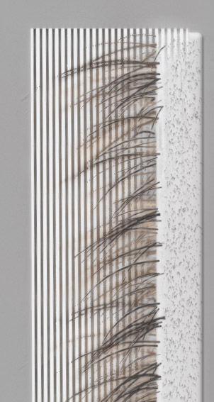
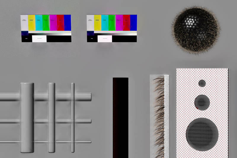
Hairs and the object behind them tend to be the main problem for me and many others. Dmap creates its characteristic halos here and also cuts the hair off in favor the the stronger details of the background. Pmax does better at keeping the hairs close to the full length and does pretty well at keeping detail at the base of the hairs. This is a very challenging test for image stacking which is clear by looking at the image rendered without DoF. Dmap Back to Front and RFDR left out for being unremarkable.

These holes were used to show a foreground object obscuring detail and contrast from an object behind it. This test was not totally successful, though you can see the effect in action in both Pmax and Dmap image. Next time I will need to use objects further away or a smaller aperture to make the effect stronger. The objects are slanted away from each other, which you should be able to deduce in the depth images coming next. Removed Back to Front for being identical to Front to Back.
Interestingly here I see some focus banding that was not intentional. I calculated the step size using Rik's DoF spreadsheet found HERE. HERE is an image of the settings used to calculate the step size. I assume that this apparent focus banding comes from a lack of any degradation of the rest of the image from other sources and in the real world the focus banding would not be noticeable.
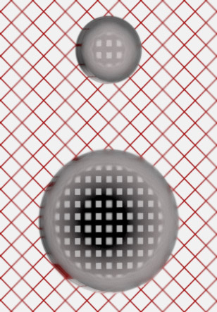
Here is the most informative set of images to me. The first image is a rendered depth map of the scene. Next is the depth map generated by Zerene stacker. The third image is modified to look similar to Zerene's depth map output to make it easier to compare.
Zerene seems to have chose a middle image to construct most of the background from, leaving the background in the depthmap middle grey. Based on the shading I can see that Zerene does a very good job of figuring out where everything is in 3d space to the point where I only see small errors, particularly with the color panels. It is clear that Dmap is finding the depth incorrectly there and therefore selecting the wrong images. I think this would be helped with a stronger or weaker contrast threshold, but it is impractical for me to test various contrast thresholds for these images given the scope. Instead I tried to use a threshold that was approximately 'correct' for the image.
What to take away from this test? I am not sure. For now I consider it more of a curiosity. Several things in mind if I decide to revisit for me to change: large depth(more images), fix the 'holes' object to be more pronounced and varied, adjust transparent foreground artifact test, fix perspective, alignment testing, resolution test for sampling during alignment, and whatever else maybe suggested... That is if I decide it is worth revisiting. For now I think the next test is to see how close one can get to the no DoF image through retouching and substacks.
Overall I think Zerene did quite well despite the fact the intention was to exploit issues with stacking software.
If you had trouble viewing images you can download zips of the images used above here:
Full Sized
Depthmaps with adjustment psd
If you would like the crops from above then:
Color Panel Noise
Color Panel No Noise
Bars
Brown Bar
Hairy Bar
Holes
Hair Ball